Logo For a Photographer
The keen earthling studios is a photography firm is based out of Pune, India. The photographer needed very graceful, minimalistic, close two nature logo for the firm, which will reflect her work style. So I used mono color for the logo, Clean, simple, readable and lean font and most importantly a graceful brand icon.


If the firm decides to create bags to deliver print projects the minimalistic brand icon will help to accentuate the feel of the brand. Here are a couple of example of how!
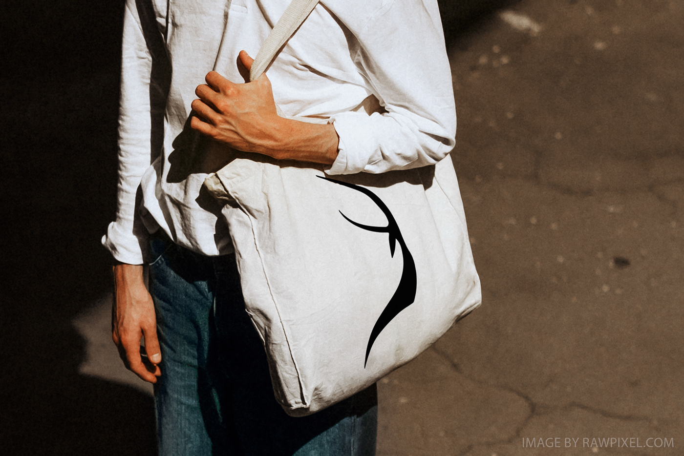

Images used above are mockups, to give client an idea of how the logo can be used in different ways and how will it look in a couple of different situations. Other than this logo can be reflected effectively on caps, t-shirts and sign boards etc.


